

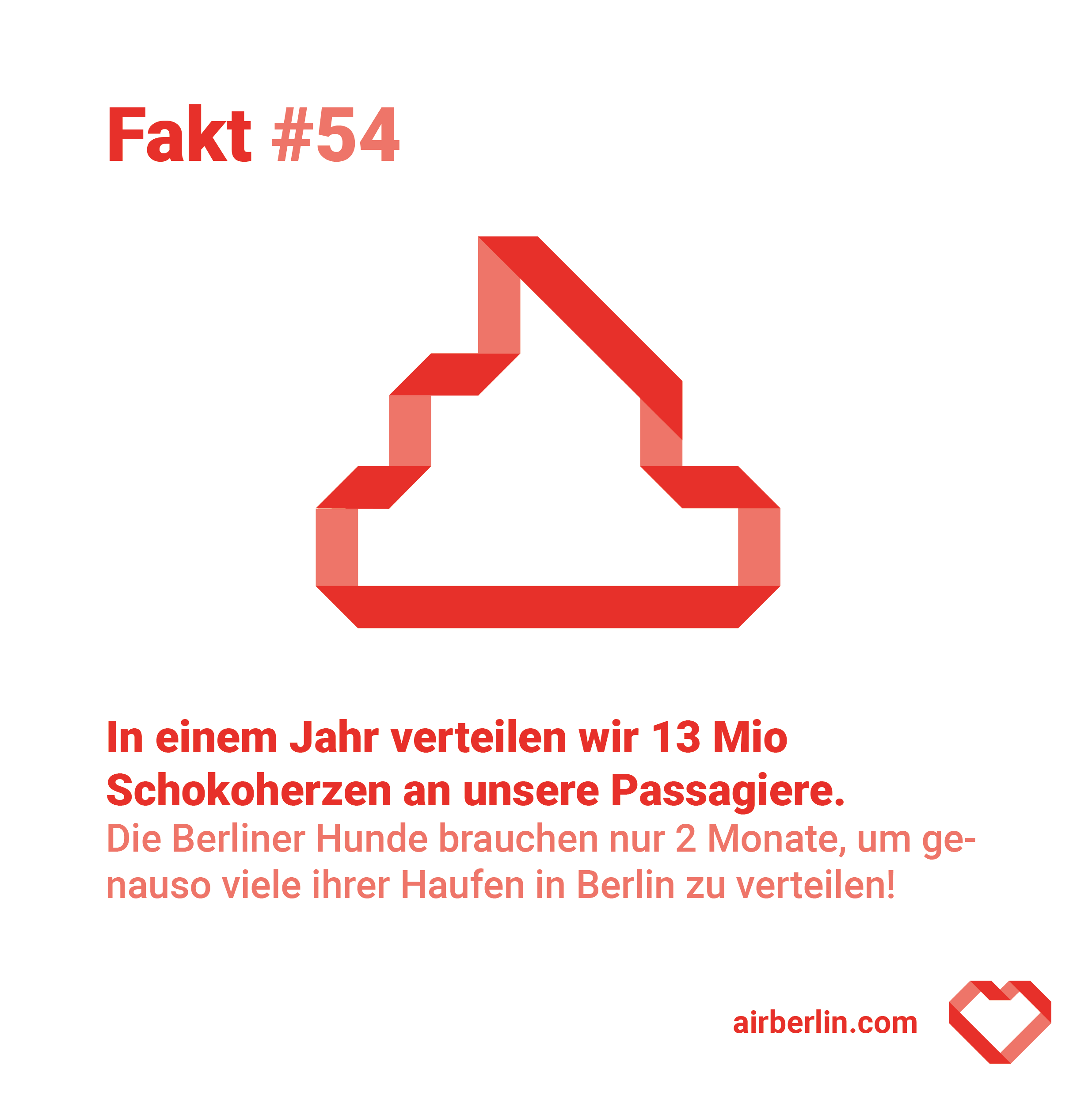
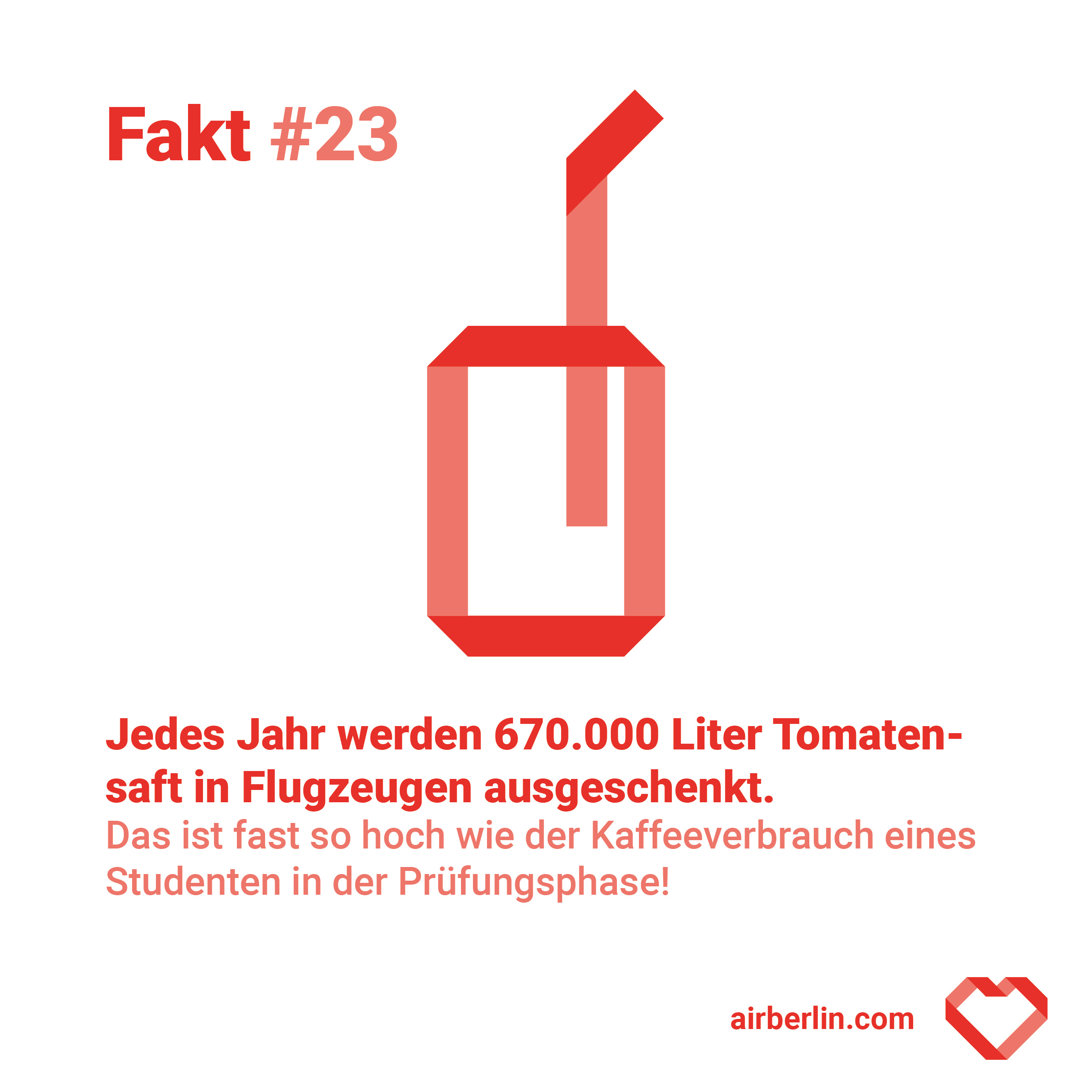
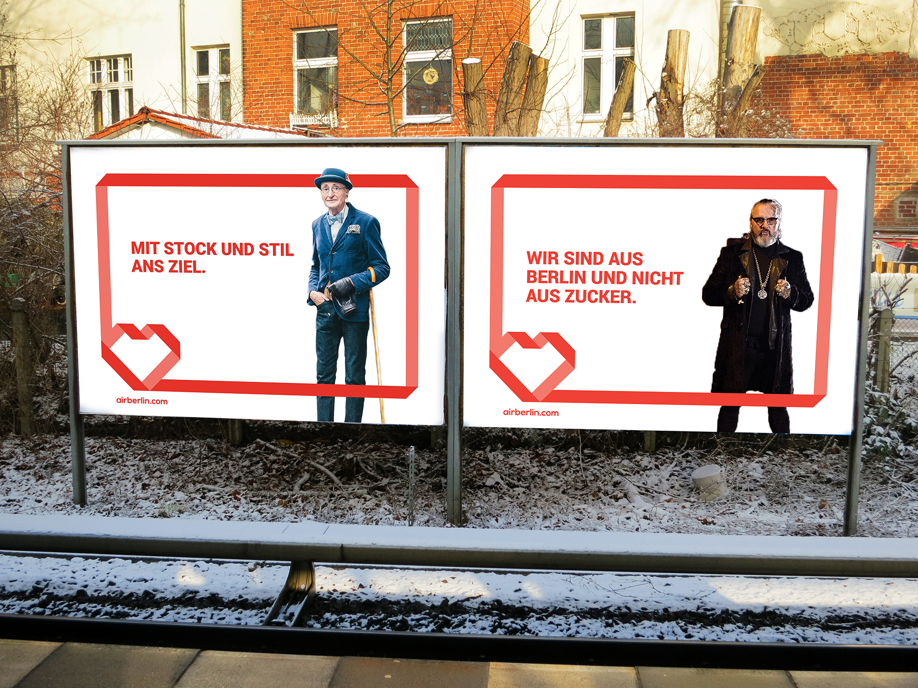
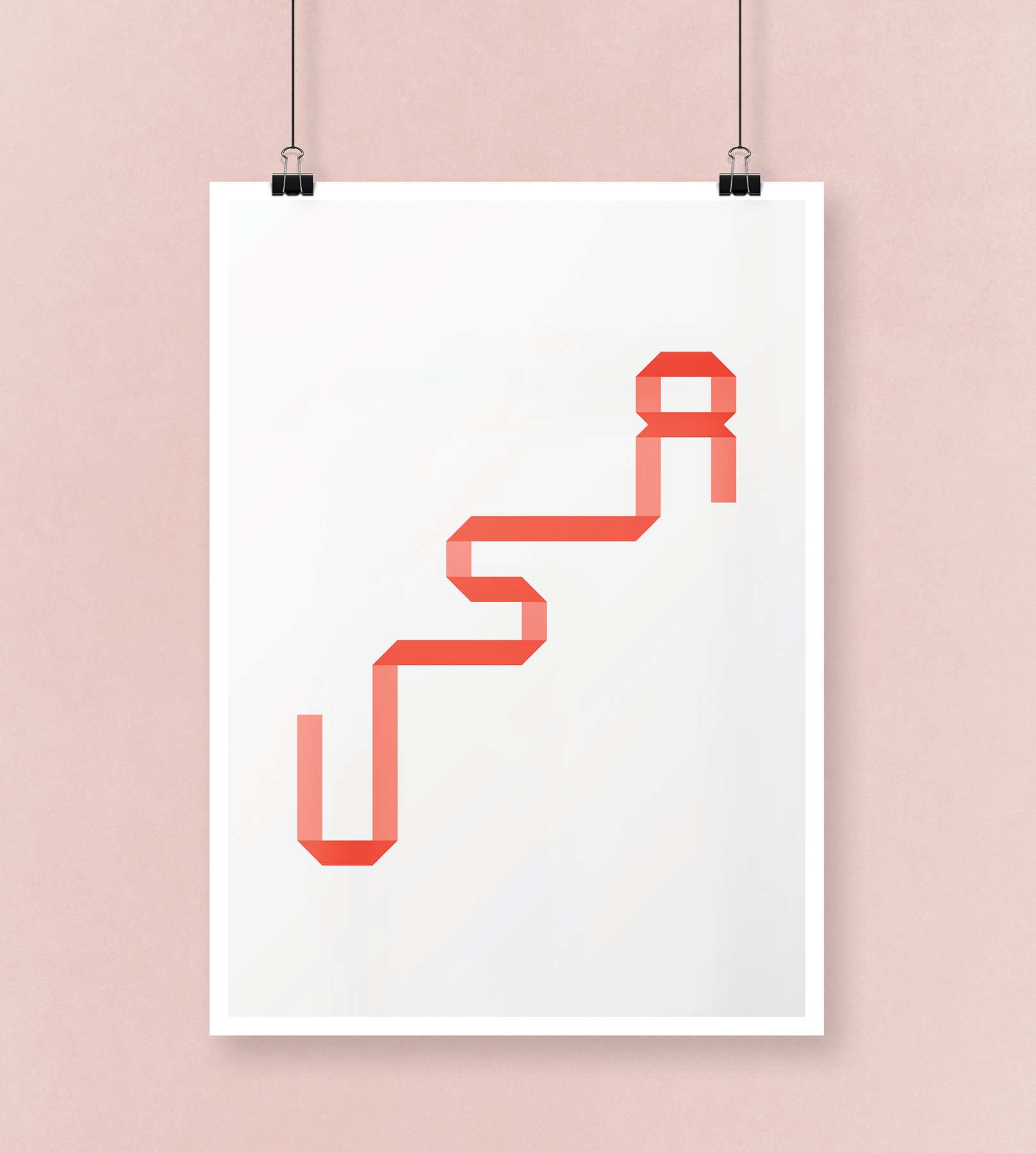
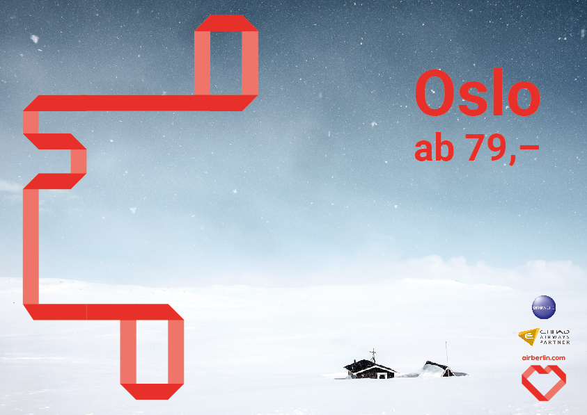
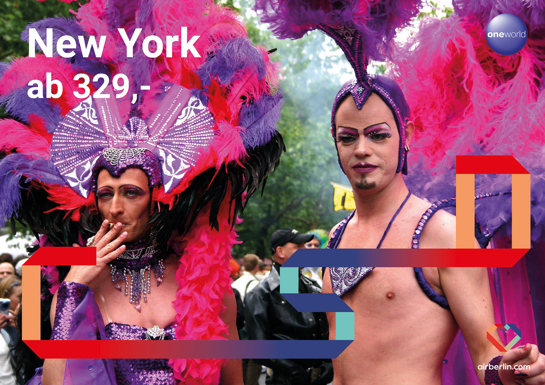
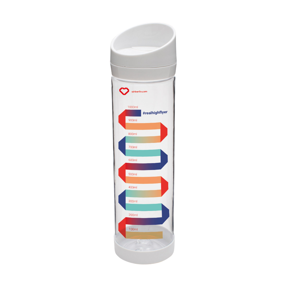
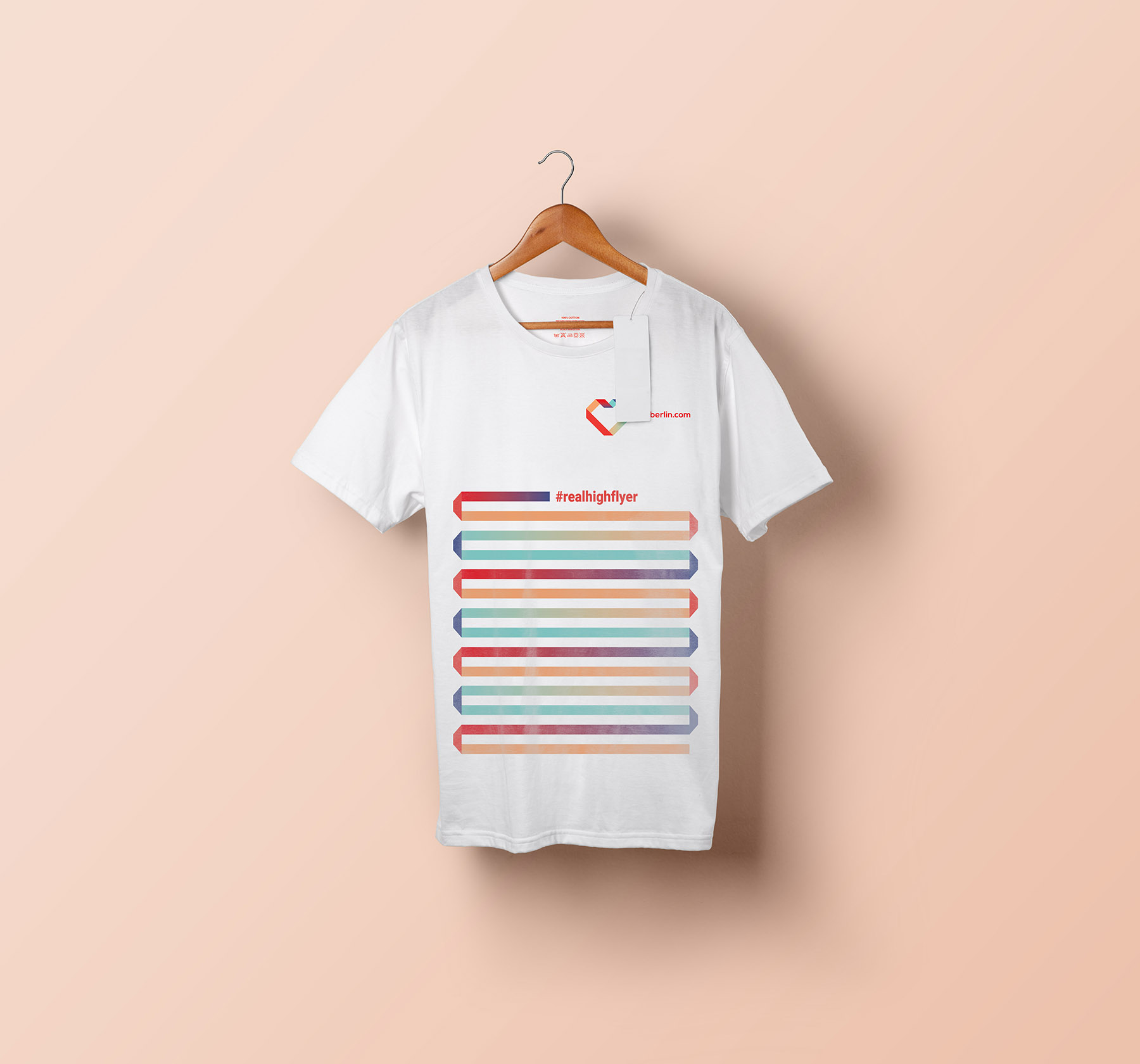
I did a corporate design course in the third semester of my studies. The task was to help the German airline Airberlin to a better image, after it had gotten bad publicity for the most part of the previous years. Airberlin wished to profit of the creative, stylish and rough image the city of Berlin has. Additionally they wanted to specifically target LGBT people. Together with economy communications students we developed a concept that contained visual as well as communicative measurements. During the research phase we found that the chocolate heart that the airline used to distribute at the end of each flight, was the nr. 1 positive thing that people linked to Airberlin. We picked up on that and let a tie create a heart for the logo, the tie also being a metaphor for logistics, moving and connecting. It appears coherently in the whole design, in shape of icons, as frames for posters as well as letters and words, that appear in a billboard campaign and hint to destinations. We furthermore created an image campaign that involves popular Berlin personalities, like the doorman of the famous Berghain, Sven Marquardt or hipster-grandpha Günther Krabbenhöft, who bestow Airberlin with a saucy, bold image and give the former sleek company some rough edges. A third campaign expands the corporate color palette and speaks with relevant motives specifically to the LGBT group.
Copyright: 2020 Julia Kuhley. Impressum