

Liquid Barcodes is a B2B company specializing in loyalty programs for convenience stores, gas stations, coffee shops and the like. They are one of the biggest players in their field internationally, but were not able to communicate their product offering on their website and with their identity.
The initial brief was a styleguide, based on the website they had, with slight adjustments to appear more „human“ and communicate what it is they’re doing in a better, and less understated way.
It turned out to become an extensive rebranding, a process that wasn’t always comfortable for both sides, but very necessary and left all parties proud and happy in the end.
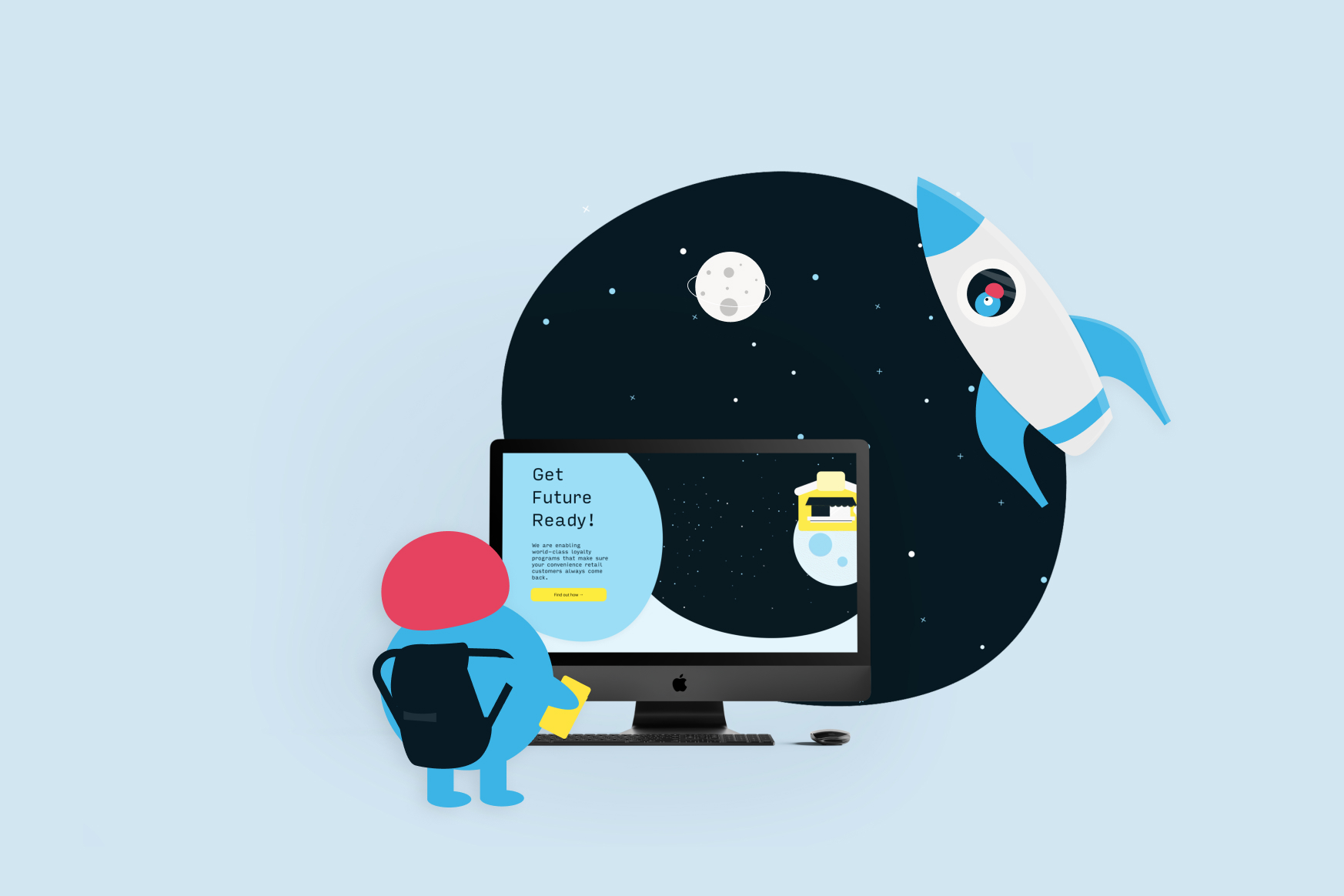
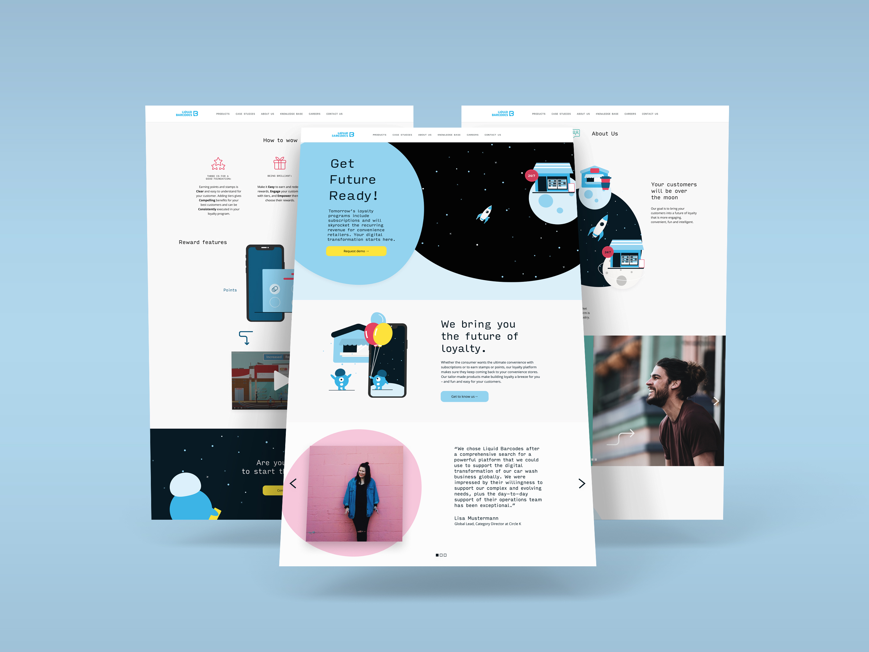
Everything is based on the concept of „future“ and space flight. We communicate that Liquid Barcodes brings loyalty programs to the future - being bold and playful by using a space theme throughout the whole design, including the tone of voice. In this way LB is portrayed as an ambitious business partner, who is regardless self-confident enough to use easy language and friendly illustrations to explain what they’re offering. Moreover, by putting focus on the people working at LB, and not just their positions but also who they are after work, we make LB approachable and human.
By setting up a design system from the start we were able to do implement this concept stringently and create a coherent whole. We extended LB’s color palette by nothing less than 5 new tones, chose the futuristic, techy and modern „Input Sans“ as the new main font, and introduced „blob“-shapes as a new visual.
After the first phase when I worked together with a colleague my role was design lead on this project, developing the concept around the space theme and applying it not only on the website, visuals, and an animation, and contributing to the copywriting.


Copyright: 2021 Julia Kuhley. Impressum